“When I tried to understand all this, it was oppressive to me till I entered the sanctuary of God . . .” (Psalm 73:16-17)
Asaph affirmed that God was surely good to his people (Ps. 73:1), but at times this Hebrew saint pondered why the wicked prospered. Then, in an enlightening epiphany, he saw things correctly when he entered the sanctuary of God. Entering a God-centered sanctuary may affect both worship and worshipers. We pray that many will enter this sanctuary to worship God in spirit and in truth.
Foundations
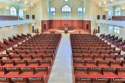
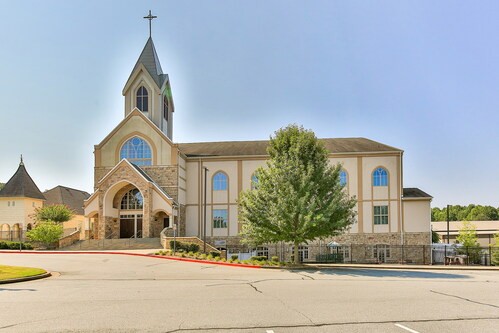
Our sanctuary, actually the fifth sanctuary on this 12-acre parcel in 160 years, was dedicated on January 25, 2009. It was part of a comprehensive expansion that lasted over four years. The congregation first gave its approval for an ambitious building program (including a fellowship hall, parking, educational and administrative spaces) in November 2005. Groundbreaking took place on May 6, 2007, and the occupancy permit was granted on January 13, 2009. By its occupation, the committed people in this generous congregation had contributed almost 2/3 of the total cost. A sanctuary study sub-committee visited the Independent Presbyterian Church in Savannah, Georgia, in June 2006 and found that sanctuary (orig. 1819) so well-suited and theologically rich that it was chosen as a model for our sanctuary’s floor plan. The 1220-person seating capacity (920 on the floor and 300 in the balcony) is the maximum our property and parking requirements will accommodate. The clear intent was not to design a multi-purpose space but to provide a sacred space uniquely suited to house the worship of God’s people for years to come. All aspects of the sanctuary seek their fulfillment in that goal.
Features
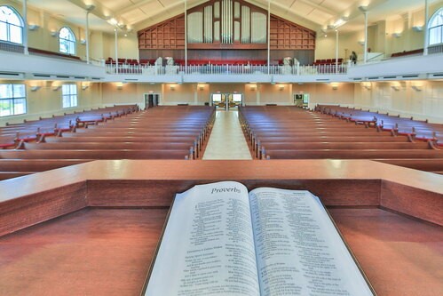
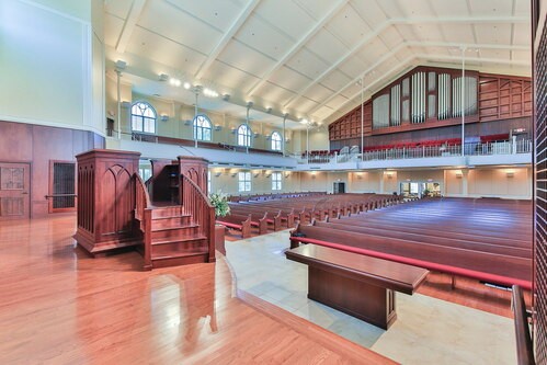
Our sanctuary is characterized by three large features. Compared to many other modern sanctuaries, this one is (a) wide, (b) high, and (c) light-filled. It is wide enough to hold as many people as possible in God’s house, thus emphasizing the unity of the body. It is high—both for acoustical reasons and to emphasize the exalted, transcendent status of God—and as Isaiah noted, the Lord was “high and lifted up, and his train filled the temple” (Is. 6:1). It features much light, with large windows to allow natural radiance so that God’s people may read and focus on God’s Word. Like a large Puritan Meeting House in New England, this sanctuary is designed for God’s covenant people to gather and be fed by his Word.
This sanctuary also has a simple and timeless design. The wall colors were chosen for simplicity, tranquility, and timelessness. The arrangement of pews allows maximum seating in the space, while focusing attention forward toward the proclaimed Word. Many attempts were made to minimize distracting features. The windows are clear glass, exhibiting Trinitarian symbolism, which is also repeated on the pew-ends and on the pulpit and sacramental furniture. The overt symbols, thus, are Trinitarian and Word-centered.
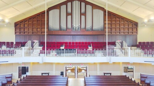
Moreover, the Choir is placed in the rear loft—a statement that neither music nor entertainment is the focus of worship. In that location, the choir and organ assist the congregation in singing and giving praise. Early decisions were made to design the acoustics as much as possible for unified congregational singing, with the choir playing a supportive role for worship. The strategic and intentional location of the choir in the balcony was made for the following reasons:
In September 2006, Midway contracted with the A. E. Schlueter Pipe Organ Company, located in Lithonia, Georgia, to design and build a masterful pipe organ. Our Director of Music, Mrs. Judy Dodd, led in identifying the builder and arranging for this wonderful instrument to be built. The Schlueter Organ has 3 manuals and 59 ranks of pipes, each representing an instrument. The organ has several 16-foot-long pipes, and 4 of the bass ranks are digital. A wonderful Steinway piano was also dedicated to support the music and worship in February 2009.
This sanctuary also has a simple and timeless design. The wall colors were chosen for simplicity, tranquility, and timelessness. The arrangement of pews allows maximum seating in the space, while focusing attention forward toward the proclaimed Word. Many attempts were made to minimize distracting features. The windows are clear glass, exhibiting Trinitarian symbolism, which is also repeated on the pew-ends and on the pulpit and sacramental furniture. The overt symbols, thus, are Trinitarian and Word-centered.
Moreover, the Choir is placed in the rear loft—a statement that neither music nor entertainment is the focus of worship. In that location, the choir and organ assist the congregation in singing and giving praise. Early decisions were made to design the acoustics as much as possible for unified congregational singing, with the choir playing a supportive role for worship. The strategic and intentional location of the choir in the balcony was made for the following reasons:
- The choir, singing through and with the congregation, supports and undergirds congregational singing.
- In contrast to some liturgical notions that view the choir as part of the priesthood, necessitating two chancel areas, the choir is part of the congregation, not part of a liturgical team or the priesthood.
- In contrast to the Victorian church model, which relocated the choir to the front of the church for effect, when the choir sings an anthem, the worshippers are able to focus on the words being sung and not be distracted by the visual.
In September 2006, Midway contracted with the A. E. Schlueter Pipe Organ Company, located in Lithonia, Georgia, to design and build a masterful pipe organ. Our Director of Music, Mrs. Judy Dodd, led in identifying the builder and arranging for this wonderful instrument to be built. The Schlueter Organ has 3 manuals and 59 ranks of pipes, each representing an instrument. The organ has several 16-foot-long pipes, and 4 of the bass ranks are digital. A wonderful Steinway piano was also dedicated to support the music and worship in February 2009.
Furniture
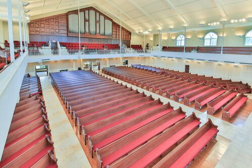
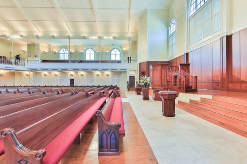
The pews are made of fine mahogany. The stateliness and durability of this high quality wood contributes understated elegance to sanctuary furniture with lasting dignity and strength. Acoustical consultants, seeking to retain as much live reverberation as possible, had recommended retaining as many hard surfaces as possible. The wine color of the seat cushions symbolizes the blood of Christ.
The most prominent physical furniture is the pulpit, which rests on the chancel that is approximately 3 feet off the ground. In addition, two symmetrical stairways rise an additional 3 feet above the chancel platform, such that the eye level of the preacher is approximately eight feet above the eye level of the congregation. A level main floor aids in focusing attention on the raised pulpit, which broadcasts the Word. Pointed, Gothic arch windows, along with a high ceiling, reinforce a strong vertical element to the design, while the level floor reminds worshipers of their horizontal unity with one another. At a distance, a slight goblet or chalice shape may be noted in the pulpit, designed to show the unity of Word and Sacrament in ministry through one furnishing. The Trinitarian symbol is also embossed in wood trim on the pulpit panels. A bench is located behind the pulpit for liturgists, who will be obscured except when serving the Word.
The Lord’s Table is 10-feet long and 3-feet wide. It, too, exhibits the Trinitarian symbolism in the wood trim on the front of the table, as well as conveying a sturdy yet simple design. This Table is placed on the floor to symbolize that all congregation members have access to the Table, a Reformation distinctive designed to proclaim the priesthood of all believers A large and stately baptismal font was also crafted of matching wood and is placed on the floor.
Lewis Godwin, a member and architect who assisted in conceiving the pulpit structure, notes: “Because the sanctuary is rectilinear, it does not cause the congregation to focus on itself as would ‘theatre-in-the-round’ seating. The forward-focused sanctuary puts attention on the pulpit, emphasizing preaching and the exposition of God’s Word. A secondary focus is on the sacramental elements of the table and the font, and space is provided for them to be permanent elements. This puts the order of emphasis in this manner: first, this is a preaching church; second, this is a sacramental church. The height and mass of the pulpit further emphasize the importance of preaching the Word of God. The visual strength and weight of the pulpit act in concert to take the focus off the preacher and place it on the activity of preaching.”
Focus
From the outset, the purpose of our sanctuary was designed to reflect abiding values and definite principles through our architectural choices. The sanctuary was to be consecrated space, not worldly square footage, and this is exhibited by the pulpit and a traditional ethos. Reverence was targeted, and the entire tone and style was to accentuate worship. The upward thrust to the eye, assisted by the windows and the high ceiling, supports the transcendence and holiness of God. The exclusive priority of the Word is seen in the visually captivating simplicity and design of the central pulpit. The absence of other symbols is an attempt to honor the Second Commandment as well as to constrain interest toward the Word as much as possible. Light, physically and spiritually, is to flood the room; distractions and undue ornamentations are to be avoided. For those on the main level, the level floor tilts the head upward in a respectful manner—in contrast to auditorium-style seating, which looks down on the Word, as if humans should sit comfortably in judgment of the Word. The importance of the sacraments—under the Word—is emphasized by our placement and the materials of the sacramental furniture. The unity of the congregation is emphasized in numerous ways, including the acoustically designed surfaces, which help the volume and sound.
Our sanctuary is a pristine building, with the Glory of God as its purpose. Its beauty does not rest in its opulence, but neither was pure efficiency our only criteria.
Psalm 50:2 declares: “From Zion, perfect in beauty, God shines forth.” Design properties within the sanctuary that communicate the notion of beauty include proportion, order, and harmony. However, a careful attempt was made not to over-adorn the space lest accessories contribute to distraction. With the psalmist, we say, “worship the Lord in the splendor of holiness” (Ps. 29:2), and our beliefs and actions are different because of our worship. Although but one part of the visible church, the sanctuary of Midway is dedicated to the beauty of holiness, trusting that the Eternal Spirit still works through the ministries of prayer, preaching, and the sacraments.
